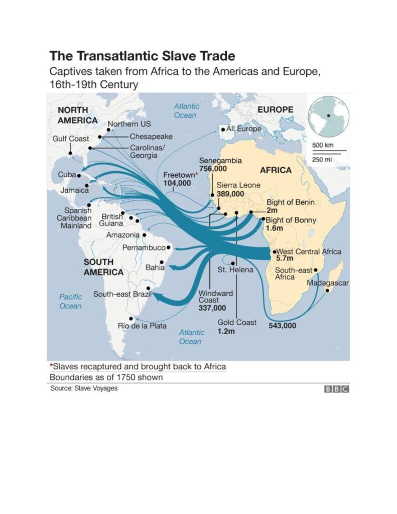
Slave trade actual numbers. Last week’s blog about a Nigerian King marrying Queen Victoria revealed an interesting chart about the actual numbers, as far as anyone can know, of the transatlantic slave trade from the 16th to the 19th centuries. It shows that the number of slaves brought to the United States was a very small proportion of the overall numbers. We tend to think, and are encouraged to think, that the majority of the slaves transshipped were bound for the plantations of the southern U.S. states. The chart below, produced by “Slave Voyages” and published by the BBC, shows otherwise.

We also tend to think that the majority of the slaves came from West Africa; that is, Senegal and Gambia round to Nigeria and Cameroon. That, also, is not true, according to this chart. The majority came from Angola and went to Brazil. Even the Caribbean received more than the U.S.
This is not, in any way, to diminish the slave trade to the U.S., but it does provide a perspective that is not widely understood in North America. It begs the question of why we, in the U.S., hear almost nothing about the enormous numbers of slaves sent to Brazil. Did they integrate? What happened to them and their descendants? When were they given citizenship? The fact that we hear so little, if anything, may mean we could learn something from their stories and their histories. The stories may be horrific, but they may be illuminating. They certainly bear further investigation, and I will do so in future blogs.
We tend to be particularly bad at learning from history, and this is a case where such learning may provide significant examples of what could be achieved when a mass influx of foreigners, particularly slaves, occurs in any country.